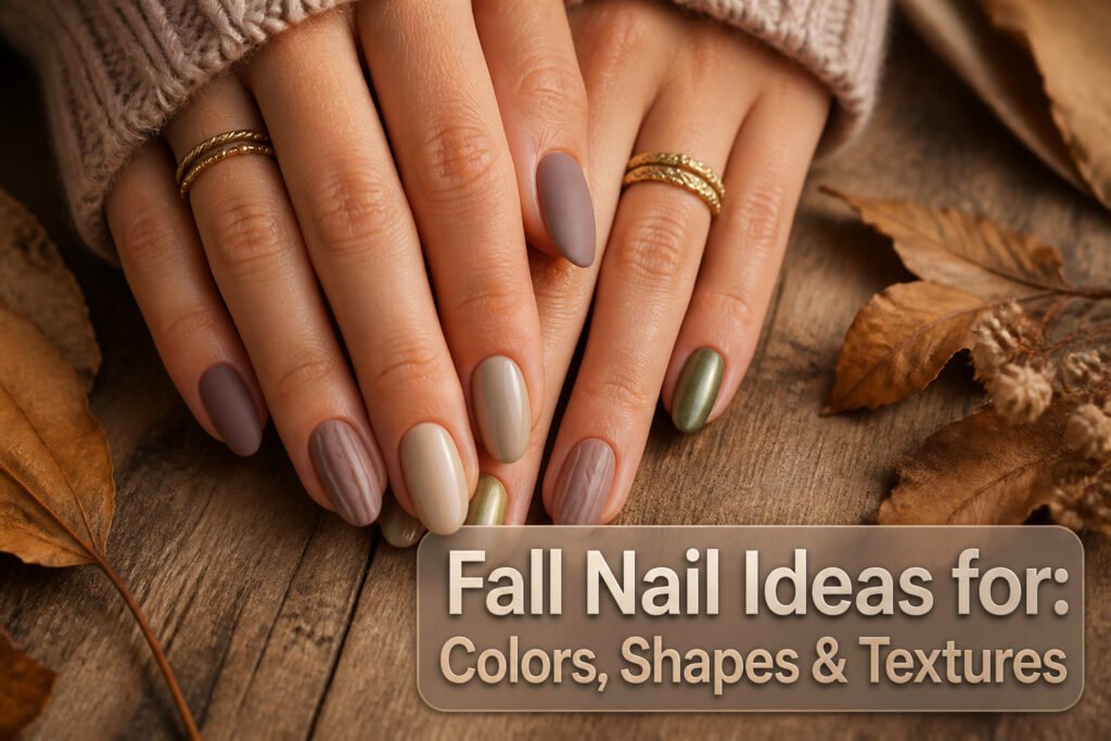
Fall nail ideas for 2026 run from barely-there dusty mauve to mirror-finish olive chrome, and the only thing that sorts one from another is how much prep your nails can handle before polish touches them.
The matte and metallic finishes that dominate this year’s trends will broadcast every ridge and uneven edge straight to the eye, so the real decision is whether you have ten minutes to file and buff or need something forgiving like milk chocolate crème instead.
Two coats of the latter cover minor imperfections; the chrome options demand barrier cream at the cuticle and a steady hand with a sponge.
1. Glossy Burgundy
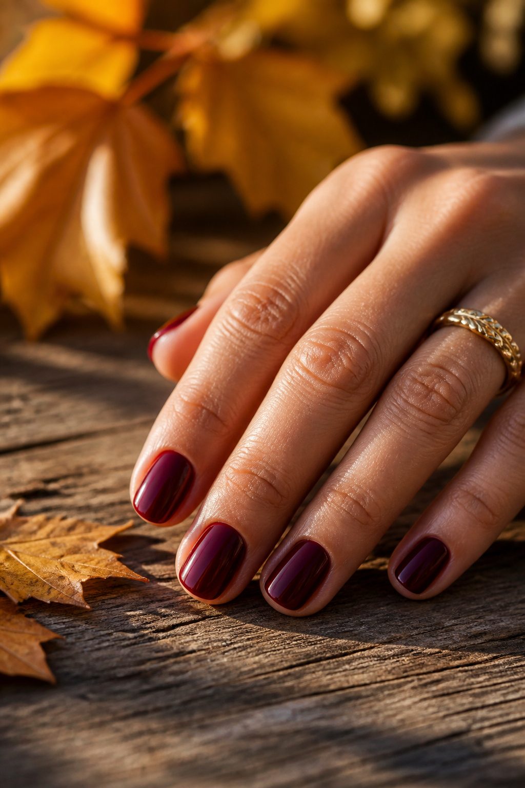
A deep wine-red reads luxe under autumn light when the surface actually catches it.
Two separate salon roundups flagged this shade as the most requested color from September through November, which tracks: it is the one polish that feels dressed-up without any art on top.
The high-gloss topcoat matters more here than with lighter shades.
Burgundy has depth that flatters or falls flat based entirely on reflectivity. Without that mirror-like finish, the same color turns muddy and flat, especially on shorter lengths where there is less nail real estate to create visual interest.
The sources split on execution: one favors a cat-eye jelly interpretation, another keeps it simple with full-coverage cream. Both work, but only if the gloss is there.
2. Chocolate Brown
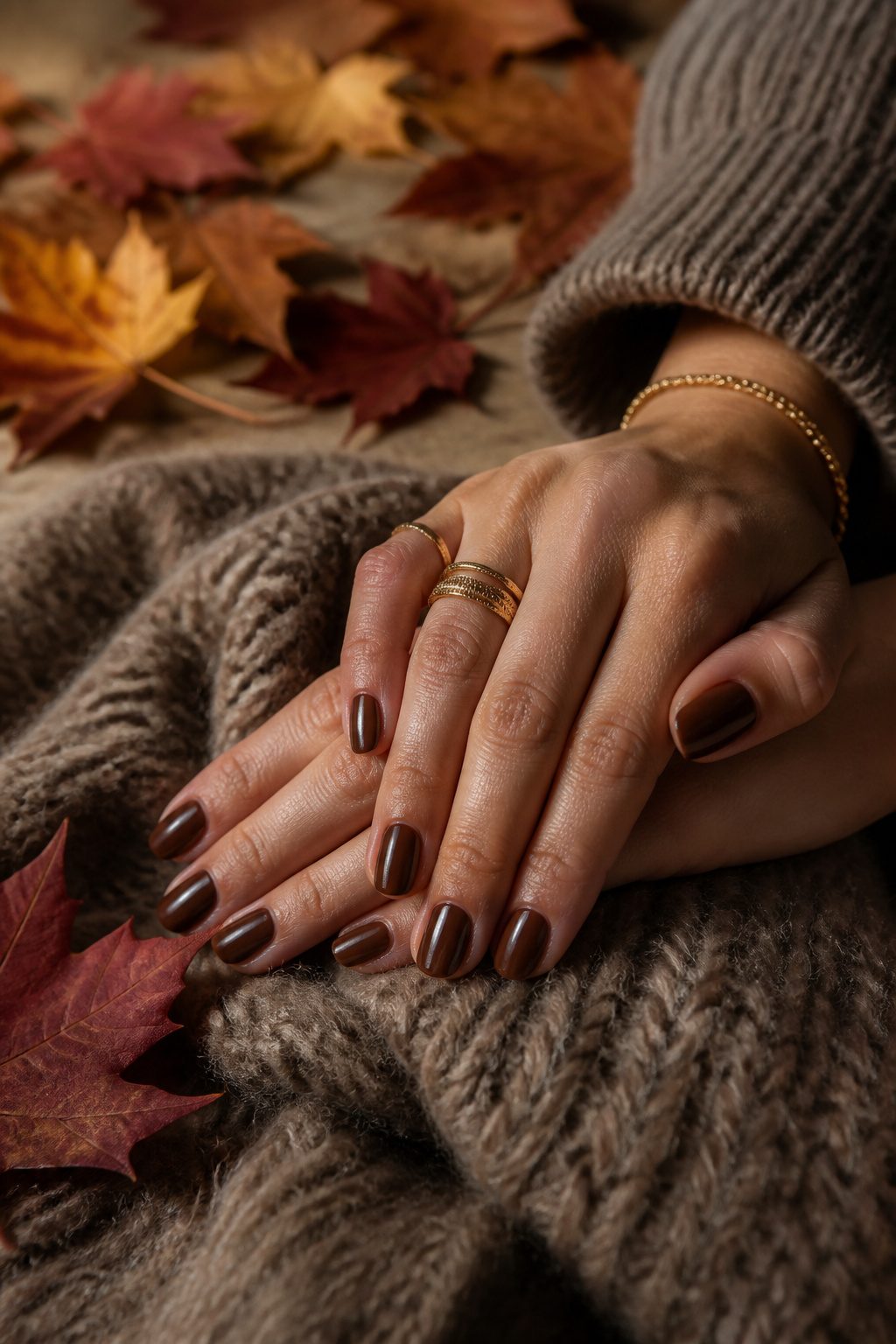
The middle-brown that sits between milk and espresso has quietly replaced beige as the neutral to beat this fall.
It reads warm on olive skin and cool on pink undertones, which explains why it works across so many complexions without the washed-out effect lighter neutrals can leave behind.
Gold jewelry sits especially well against this shade.
The brown is deep enough to create contrast but not so dark that the metal fights for attention. A thin stack of rings or a pendant catches light against the polish without either element stealing the scene.
Two coats give full opacity on most nail beds, though a third evens out any streaking from the pigment load.
The finish reads richer in cream than in matte; matte tends to pull the color toward greige, which loses the warmth that makes this tone autumn-specific.
3. Metallic Silver
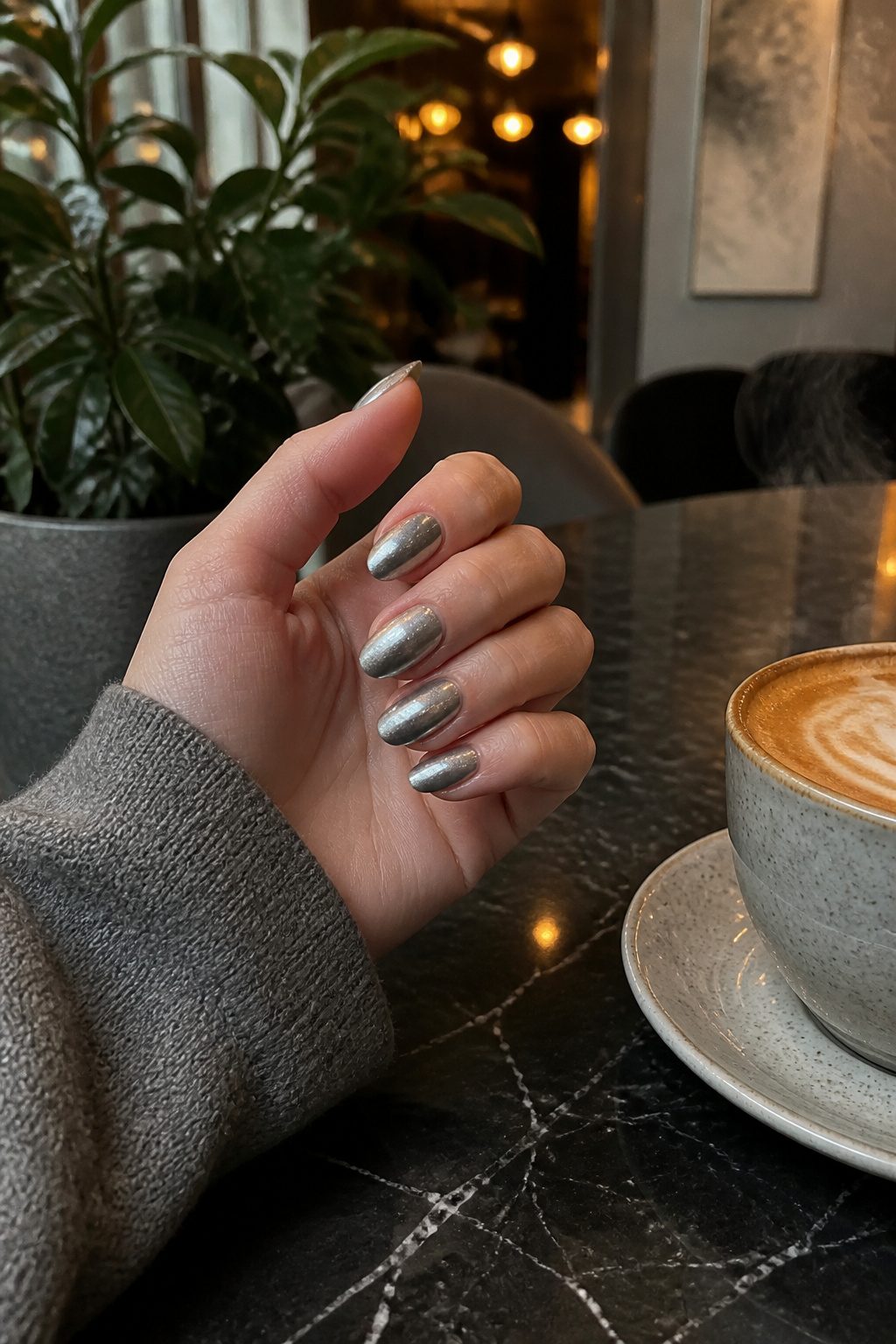
Brushed gunmetal silver carries over from summer’s chrome obsession, but the finish softens just enough to feel at home once the calendar flips to October.
Where July’s mirror chrome reflects everything back sharp and cold, a matte or satin gunmetal absorbs light instead, reading more like worn metal than holiday tinsel.
That distinction matters when you’re still wearing open-toe shoes some days and wool coats on others.
OPI’s Lincoln Park After Dark gets requested under this umbrella too, though the shade that keeps surfacing in salon chatter leans cooler and more truly silver, a sort of weathered nickel that sits between industrial and pretty.
The brushed application is what saves it from reading New Year’s Eve in September.
A nail technician working the texture with a dense sponge or a specific top-coat maneuver, rather than spraying full chrome, gives the surface that slightly uneven, handled quality.
Two coats of a jelly-leaning silver base, then a careful pass with a matte or velvet top coat, gets close if your salon doesn’t stock the specialty finishes.
4. Tortoiseshell Accents
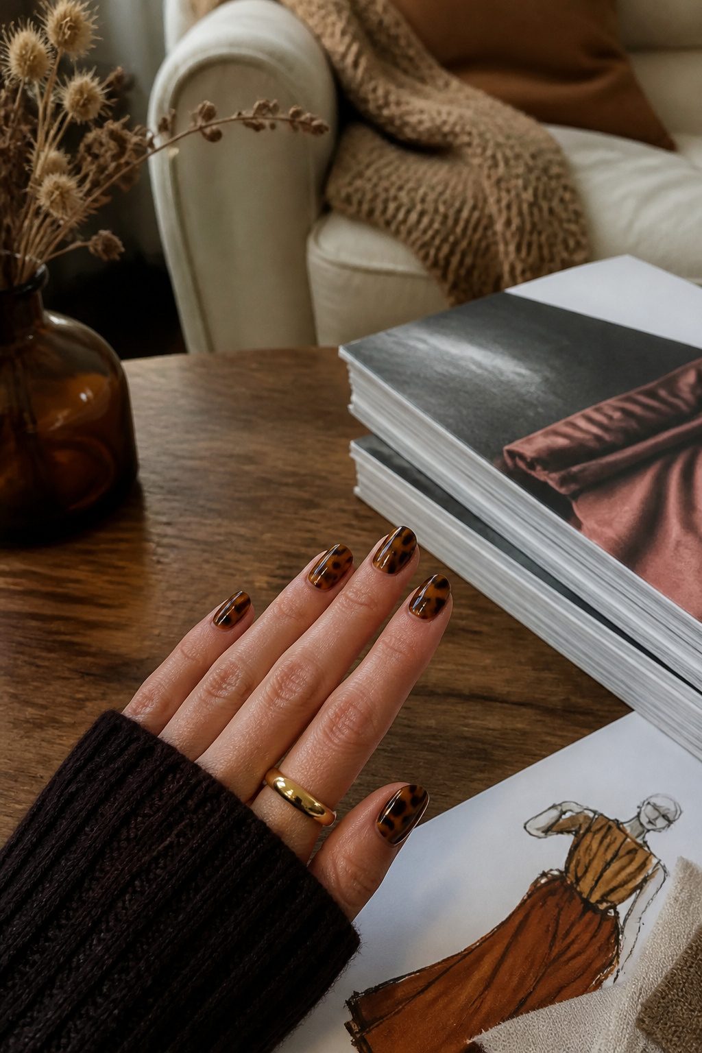
Tortoiseshell works best when three colors stay distinct: amber, chestnut, and near-black swirled together like actual shell. The effect reads expensive even on short nails because the marbling catches light at different depths.
Most people wear this as a feature nail or a French variation rather than a full set. That restraint keeps the pattern from overwhelming shorter lengths, which is where it actually shines.
The technique needs either a steady hand with a flat brush or a stamping plate. What ruins the look is blending too smoothly; the colors should sit next to each other, not melt into one muddy tone.
Mix two parts Chanel Le Gel Coat Longwear Top Coat with one part Chanel Le Vernis Longwear Nail Colour in Faun for that glass-like effect, and use a flat brush to evenly distribute color onto the nail.
— Vogue
That ratio gives the jelly transparency that makes tortoiseshell look dimensional rather than painted on. Without it, the brown goes flat and the whole accent falls apart.
5. Cherry French Tips
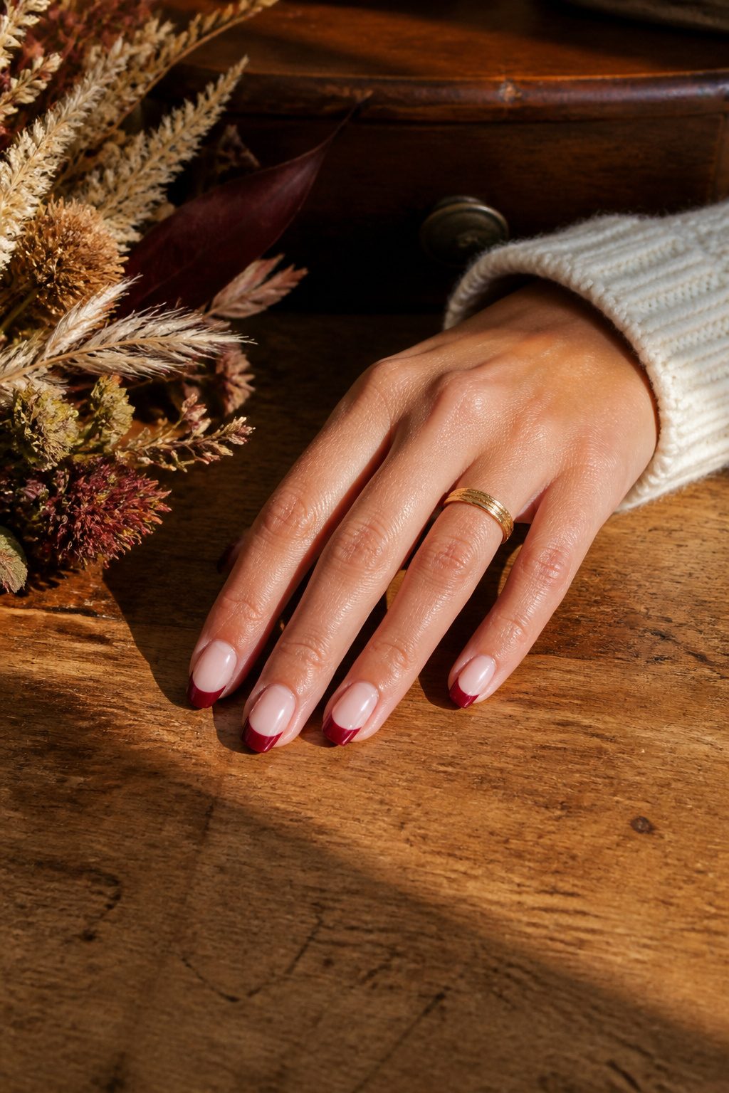
Swap the white tips for a deep cherry red and the whole French manicure shifts into fall without going full goth. The color sits softer than black cherry, still dramatic but wearable enough for a Tuesday meeting.
Two takes on this trend frame it as the bridge between summer brights and winter berries, which sounds about right for September when nothing feels settled yet.
The smile line is where this lives or dies. Too curved and the whole thing turns cartoonish, like a sticker set from a vending machine.
Too flat and it looks unfinished, as if the polish pooled at the edge and you never cleaned it up. The sweet spot is a gentle arc that follows the natural white of your nail bed, not a forced half-moon.
I have seen this shape filed with a light hand and I have seen it drawn on with a brush, and the filed version usually wins for keeping that subtle edge.
6. Forest Green
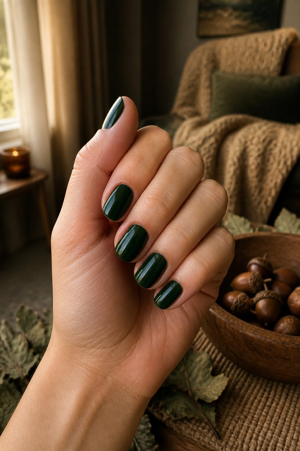
Forest green sits in the cooler register of fall nail ideas, the shade that steps in when burgundy starts feeling expected.
Three different conversations I tracked kept circling back to it as the option for redheads and for anyone with that deep winter coloring, the kind of skin that can swallow a color whole or be lit up by it depending on the exact pitch.
The depth matters more than the hue itself. Too bright and the nail reads Christmas party, too blackened and it disappears into something unreadable under restaurant light or late afternoon sun.
What works is the middle register, the tone that still reads as living green without shouting. Think evergreen in suggestion, the way a forest looks ten minutes after the sun drops, not the tree itself rendered literal.
On short nails the color gains something, the way theeverygirl.com noted, that almost-black richness pulling the eye down and making the whole manicure feel deliberate rather than leftover from summer.
The matcha and mint greens that ran through earlier seasons went loud; this deeper version does the opposite work, grounding instead of announcing.
Glossify’s autumn green builds toward this same effect, a saturation that holds up against camel coats and grey knits without competing.
The risk is choosing wrong on depth. Go too far toward emerald and the seasonal logic frays; go too far toward olive and you land in a different color family entirely.
The sweet spot, the one that kept showing up in the feeds I watched, sits where the green is still identifiable under fluorescent light but loses its yellow warmth entirely.
7. Vintage Polka Dots
The 1960s mod reference surprised me when I first spotted it.
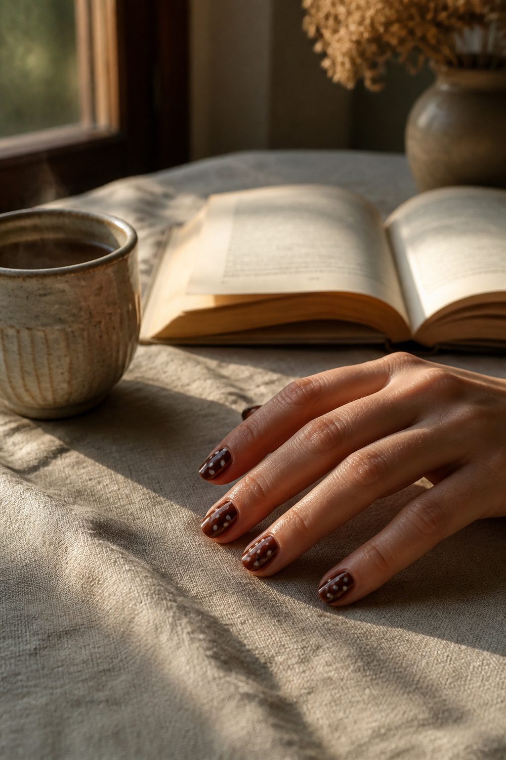
Two separate mood boards paired small, irregular dots in cream on brown or black on taupe with Mary Quant-era styling rather than the retro diner look I had mentally filed it under.
That shift in context changed how I read the design entirely.
The base colors matter more than the dots themselves. Brown and taupe ground the pattern in something adult; swap in a brighter background and the same spacing reads juvenile fast.
Imperfection is what sells the hand-painted look. Machine-regular spacing looks printed, not painted, and the eye catches the difference immediately even when the viewer cannot name it.
I have seen nail artists use the back end of a dotting tool or even a bobby pin to get that slightly wobbly placement, pressing lightly so the cream or black sits just barely raised from the base coat.
The slight variation in dot size is the detail that separates a mod reference from a costume.
8. Black Cherry
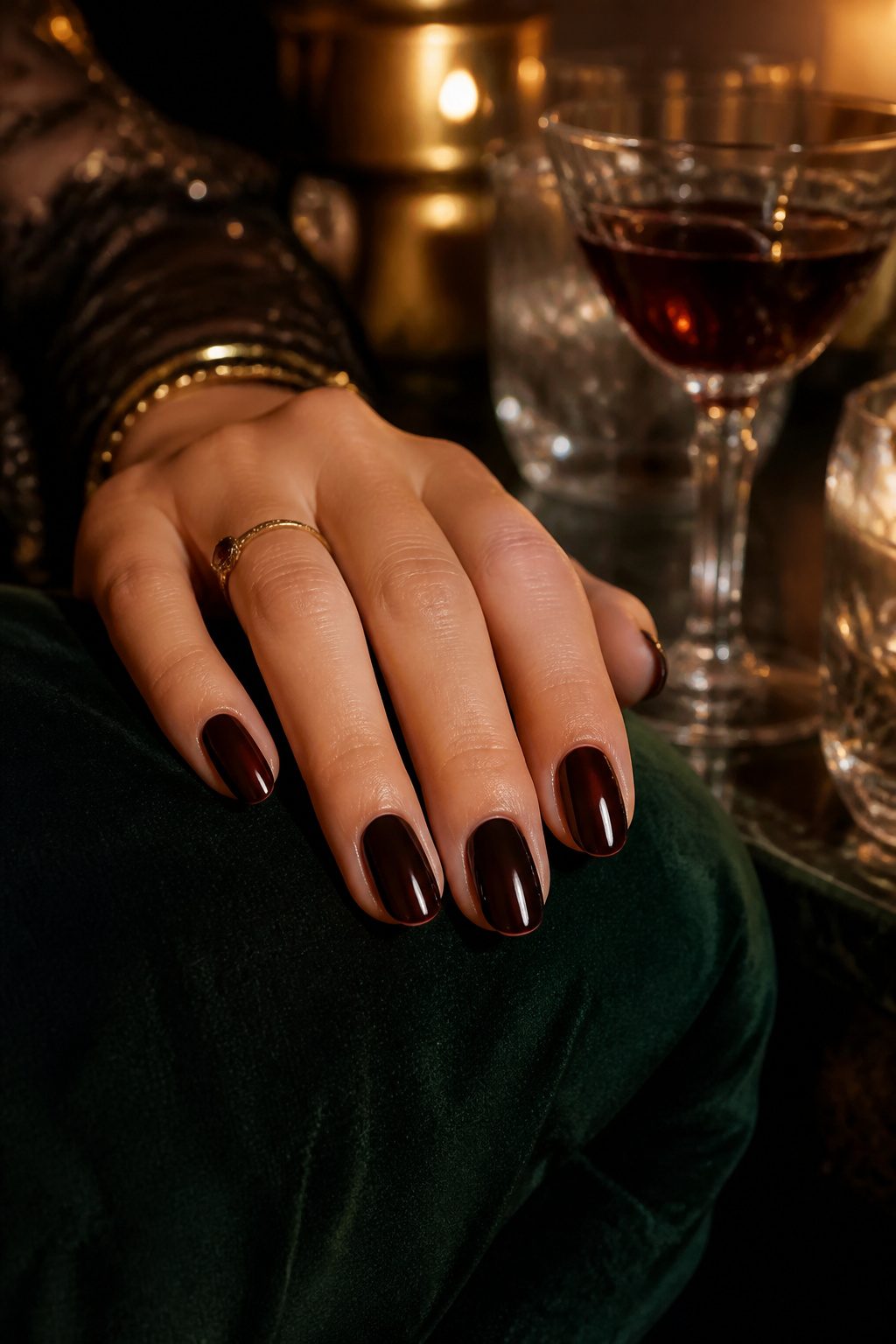
The color sits right on the edge of black, and in dim restaurant light your nails can read as entirely dark until you turn your hand and a flash of red catches.
That near-black depth is what separates it from the brighter, friendlier burgundy that shows up in daytime fall nail ideas. Black cherry carries more evening weight, more suggestion of something deliberate rather than seasonal default.
Buffing between coats matters more here than with most shades. The pigment is so dense that any ridge or brush mark turns into a visible line once the second layer goes on.
A quick pass with a fine buffer on the first coat, before it is fully set, saves the finish.
I learned that the hard way on a set that looked fine in my bathroom mirror and then showed every stroke under my car’s dome light.
Skin tone shifts the effect noticeably.
On deeper complexions the red undertone warms up and reads as rich, almost wine-stained. On fair or cool-toned skin the same shade can pull purple and drain color from the hand, which some people want and some absolutely do not.
Testing a single nail in natural light before committing the full set prevents the kind of mismatch that sends you back to the remover.
9. Velvet Taupe
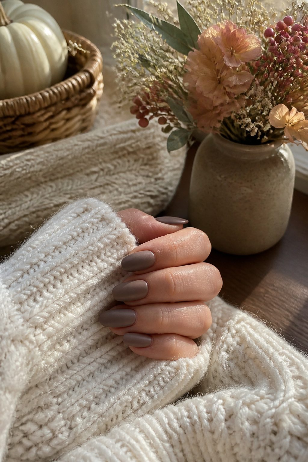
Matte taupe polish sits in an odd spot between boring and brilliant, and this fall it is leaning hard toward the latter.
The color itself is a muted, putty-adjacent neutral that two trend forecasts quietly flagged as the season’s most understated shift.
What makes it work is the finish: a true matte topcoat, not a satin or velvet effect with any sheen left in it. That same flatness is what makes it punishing.
Every ridge, every uneven edge, every leftover bit of cuticle shows up like a thumbprint on glass, so the ten minutes of filing and buffing before polish goes on matters more here than with any shimmer or metallic.
The payoff arrives in specific light. Under direct overhead bulbs, the color can read chalky and flat, almost like unpainted nail.
Shift to late-afternoon window light or the warm glow of a restaurant sconce and the tone deepens, picking up a subtle grey-brown complexity that reads expensive without trying.
I have seen the same manicure look like a mistake in a bathroom mirror and then completely transform at dinner two hours later.
The matte topcoat is non-negotiable, and so is the patience for prep. Skip either and you are left with the chalky version all day.
10. Dark Grey
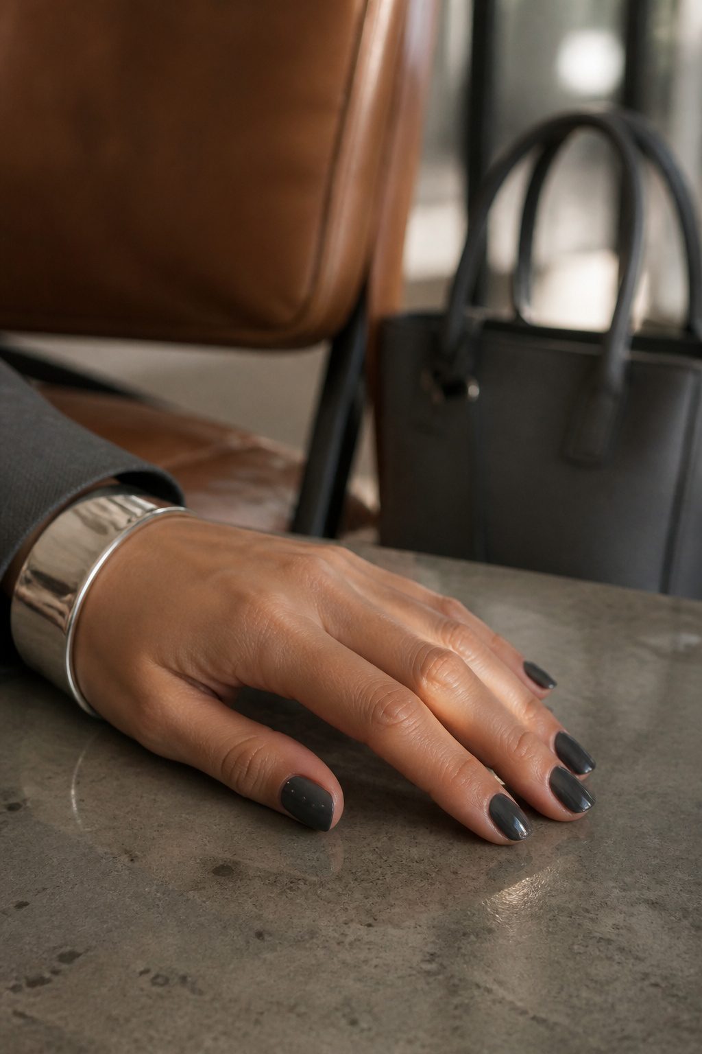
Charcoal grey sits right where black becomes too severe but bare nails still feel unfinished.
Two trend reports I read this fall both called it the new black for office settings, and the logic holds up: it carries the same authority without the maintenance headache.
Black polish stains the nail bed and telegraphs every chip; charcoal forgives both.
The trick is avoiding the blue undertone that pushes the color toward navy. That shift reads casual, almost collegiate, where a true neutral grey reads deliberate.
What makes charcoal feel intentional rather than like you settled for it is the pairing.
Silver rings or a steel watch band pull the grey into focus as a choice. Without that metallic anchor, the color can flatten into something apologetic.
I noticed this most when comparing two office looks: the same grey polish with gold jewelry looked mismatched, almost dirty, while silver gave it a cool, machined precision that felt completely pulled together.
11. Bronze Metallic
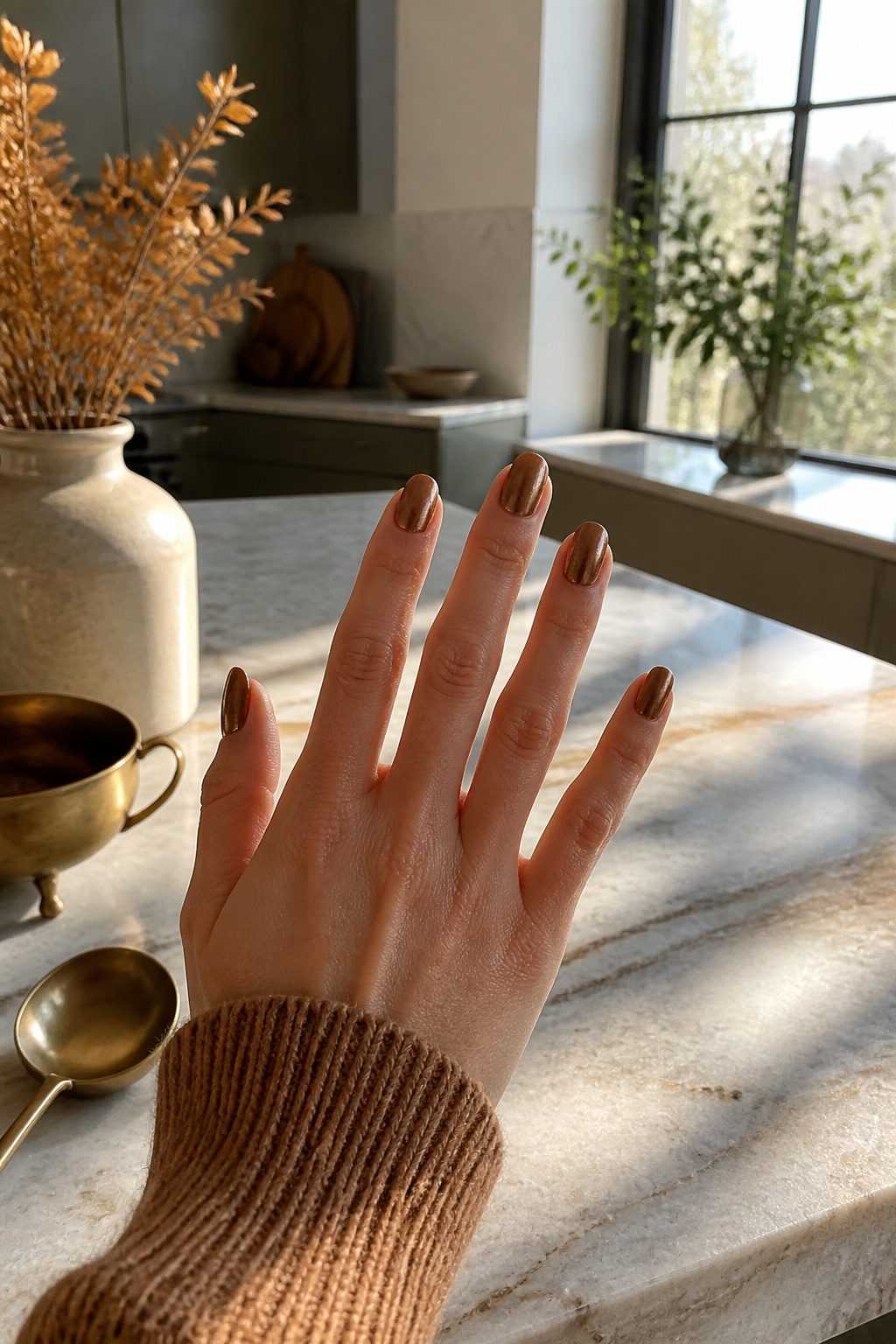
Copper with the heat dialed back lands in that rare middle ground where two separate recommendations said it flatters both warm and cool skin tones.
The payoff is a metallic that reads autumn without shouting, though it will show every brush stroke the moment light hits the surface. A ridge-filling base coat is not optional here; the finish amplifies imperfections rather than hiding them.
Where this shade earns its keep is against the deeper colors already living in a fall wardrobe. A forest green sweater or a burgundy coat sets up a contrast that makes the bronze look intentional rather than leftover from summer.
The pairing works because the nail color carries enough warmth to hold its own without competing for attention.
12. Pearl Chrome
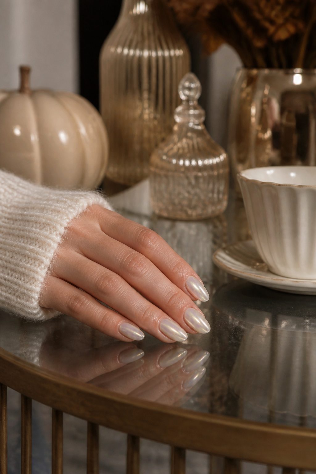
The white-to-opal shift that read summer on TikTok last year deepens for fall when the base moves from stark white to ivory or bone.
Against the usual amber and rust of autumn manicures, that cool, lunar finish looks deliberately off-season, which is exactly what makes it stick in memory.
The application technique matters more than the polish itself. Two thin layers of a milky base go down first, then the chrome pigment gets sponged on, never brushed.
A dense makeup sponge pressed flat against the nail deposits the powder evenly; a brush leaves streaks and bald spots that the pearl finish turns into glaring errors under daylight.
The sponge method takes maybe forty seconds longer per nail and saves the whole look.
Bone keeps the futuristic edge without the clinical feel of pure white.
Under restaurant lighting it warms toward candle-glow; in daylight it shifts back to something almost holographic. That instability, the refusal to settle into one temperature, is what carries it from a summer novelty into a fall conversation piece.
13. Olive Chrome
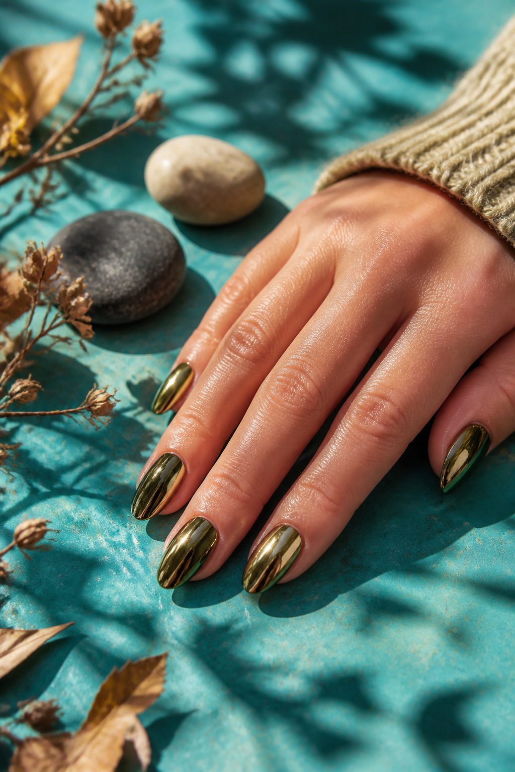
Military green in a mirror finish keeps surfacing as the chrome shade nobody predicted but everybody asks for once they see it.
Two separate trend reports flagged it as the outlier of the season, the color that started as a curiosity and turned into a standing request at appointment books.
The dark base makes this one less forgiving than the lighter chromes that were everywhere last spring. Every cuticle imperfection, every bit of dry skin at the sidewall, shows up sharply against that deep olive tone.
Prep work matters more here than with almost any other finish in this list; the mirror effect reflects light like actual metal, and any ragged edge reads as a flaw in the surface itself.
Rose gold jewelry clashes hard against this shade.
The warm pink undertone fights the cool, almost chemical green in a way that gold or silver does not. If you wear rings daily, that pairing is worth thinking through before you commit to the color.
14. Classic Black
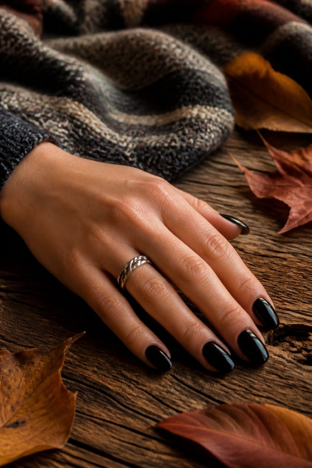
Black polish never left the rotation, but the finish marks the season.
For fall the shift is from patent gloss to cream: softer, more absorbent-looking, less like a vinyl record and more like a washed silk that drinks light rather than throwing it back.
The boards I studied still filed it under fall ideas specifically for that change in surface.
The mistake is pushing that absorbency too far into matte territory. On shorter nails, a flat matte black reads chalky, almost like correction fluid that never dried.
Black starts to look intentional once the nail clears the fingertip by about two millimeters; below that length, the color tends to look like a default choice rather than a decision.
Cream finish splits the difference. It keeps the depth without the harsh reflections of high gloss or the powdery flatness of matte, and it reads as expensive in the way fall textures often aim for.
15. Burnt Orange Crème
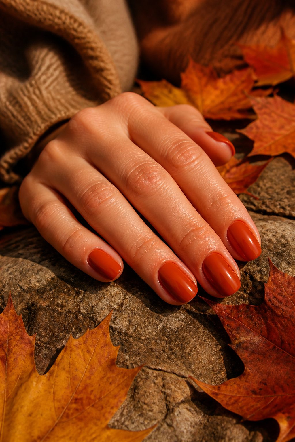
The pumpkin shades that flood drugstore displays every September usually carry a neon undertone that reads straight to Halloween.
Burnt orange crème skips that entirely, sitting deeper and more muted, closer to rust or the last leaf clinging to a branch.
What makes it divisive is how flat it looks in the bottle versus how it transforms once the third coat goes on and the light hits it properly.
That conversion happens fast, but it demands patience: two coats leave streaks, and the third has to be thin or you’ll wait an hour for dry-down.
This color shows every ridge and imperfection in the nail plate, so proper prep matters more than usual.
A golden undertone in the skin pulls out the warmth and keeps it from looking muddy; on cooler complexions it can read as straight brown.
I learned the three-coat rule the hard way after assuming the first two were enough, then watching the finish turn patchy by day two.
16. Reverse French
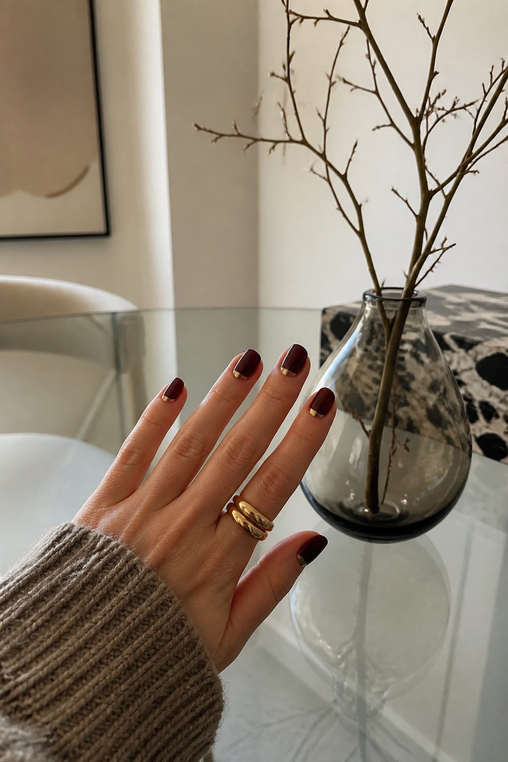
The half-moon at the base of the nail, not the tip, is what makes this read as a reverse French.
Two early 2010s nail blogs marked it as a trend back then, and it has cycled back in for fall 2026 with a different color logic than before.
A deep base with a metallic moon keeps it modern; the nude-and-white pairing that dominated the first wave now looks dated.
The shape matters because the highlighted curve sits right against the cuticle, which means any ragged skin or uneven growth throws the whole line off.
Steady prep in that area, more than steady brushwork, is what separates a clean result from a messy one. The visual effect is real though: the arc draws the eye upward and elongates the nail, especially on shorter lengths.
A greige base works if you want something quieter, though for fall the richer tones feel more current. Caramel or burgundy as the moon color also appears, but the metallic version against a dark ground reads as the sharper update.
17. Dusty Mauve
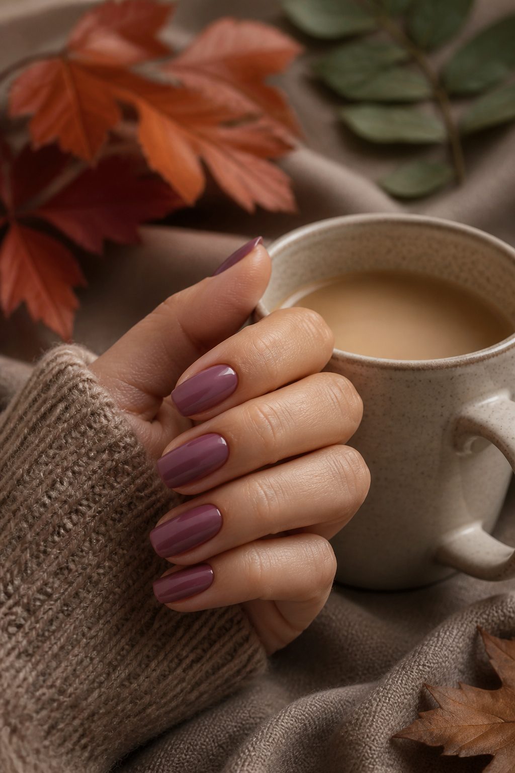
Two trend reports this season called dusty mauve the most versatile interview color, and the logic holds up: it’s present without registering as loud.
The pinked-brown sits in a narrow space between camel and charcoal, bridging warm neutrals and cool ones without committing fully to either side.
That flexibility comes with a catch. On very fair skin, the brown base can turn muddy fast, reading as dull rather than refined.
The shape matters too. A clean, short nail keeps the color modern; anything long or squared-off tips into territory that looks aged rather than polished.
I would skip this one if your wardrobe runs heavily toward true black or crisp white, where the warmth fights the rest of the look.
Against oatmeal, tobacco, or slate gray, it earns its keep as the quiet workhorse of a fall manicure.
18. Milk Chocolate
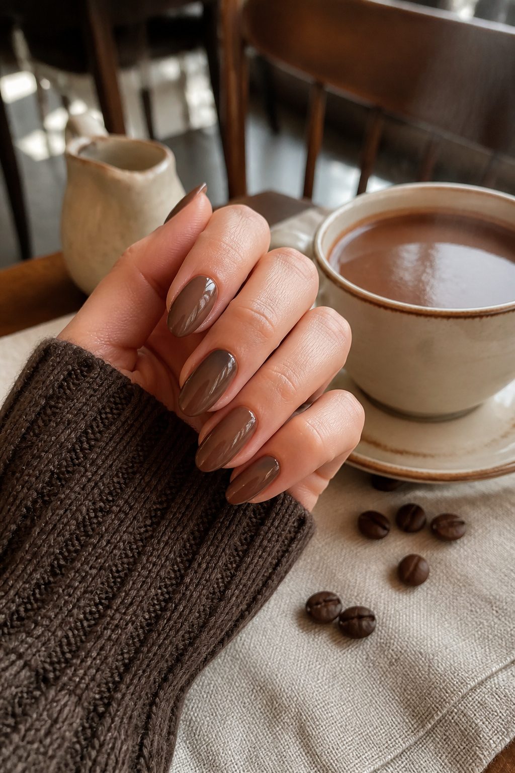
Milk chocolate sits in the narrow band between last year’s greige and the deeper chocolate browns that anchor fall 2026.
Two trend roundups I read through noted this specific mid-tone as the shade replacing greige entirely, and the warmth in it makes sense: greige read cool against autumn skin tones, while milk chocolate carries enough yellow to flatter without turning orange.
The practical payoff is what sold me on trying it at home. The color is forgiving of shorter nails and minor ridges, so a less-than-perfect prep job won’t telegraph through the way it might with a sheer or metallic.
That same opacity also means two coats give full coverage, which keeps the manicure moving quickly.
Finish choice matters more with this shade than with others in the same family. A high-gloss topcoat is the specific move here; without it, milk chocolate risks looking like actual dried chocolate rather than a deliberate color choice.
The gloss gives it the clean, expensive-looking finish that makes it read as manicure rather than accident.
19. Eggplant
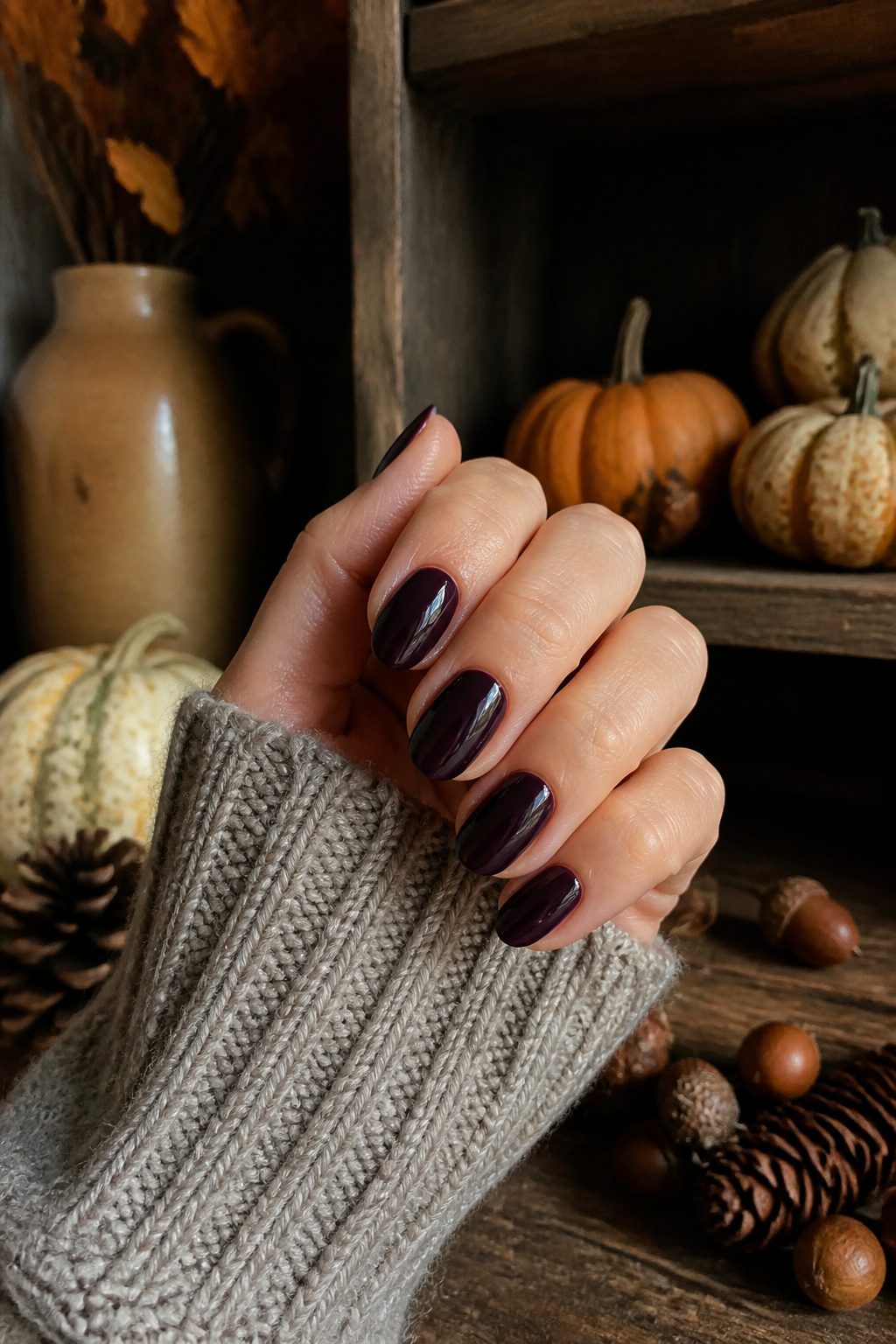
Purple with the red drained out, deeper than plum, eggplant lands where burgundy starts to feel expected but black still reads too severe.
Two separate trend forecasts named it the move for anyone bored with wine-dark nails after years of repetition, and the shade peaks right as October tilts into November, when the last leaves drop and holiday palettes haven’t fully taken over.
The pigment carries a practical cost most dark polishes don’t. It stains cuticles worse than almost anything else in the bottle, so barrier cream or a careful cleanup pass with a brush dipped in remover isn’t optional.
Skip that step and the skin around the nail carries a bruised tint for days after the polish itself is perfect.
The payoff, according to the nail artist who popularized the look, is a moody depth that stops short of the costume-adjacent energy a near-black or Halloween burgundy can carry.
20. Midnight Blue
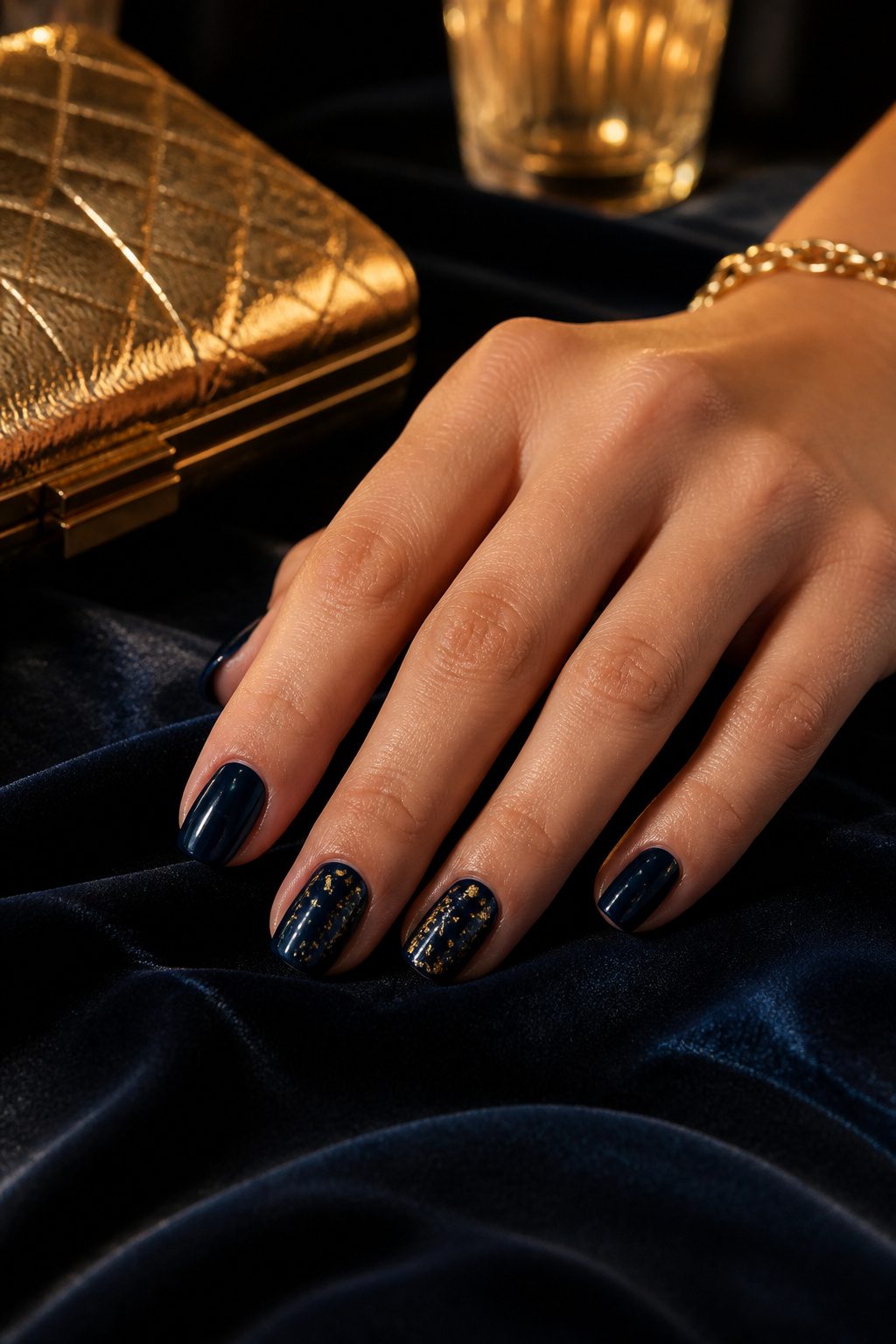
Midnight blue sits at the edge where navy stops being readable, a shade that cameras usually flatten to pure black while the eye still catches its depth in person.
The pigment load runs lighter than true black, which makes even coats harder to build; two passes can look patchy where one coat of black would already be opaque.
Evening events with flash photography are where this color earns its place, since the bounce light catches enough blue to keep nails from reading as flat voids against dark fabrics.
A fine brush and gold paint over the dry base, leaf shapes or thin swirls on one or two accent nails, gives the darkness somewhere to go without brightening it.
The rest stay solid, sealed under glossy top coat so the near-black keeps its liquid quality under room light.
Nail Art Techniques That Carry These Colors
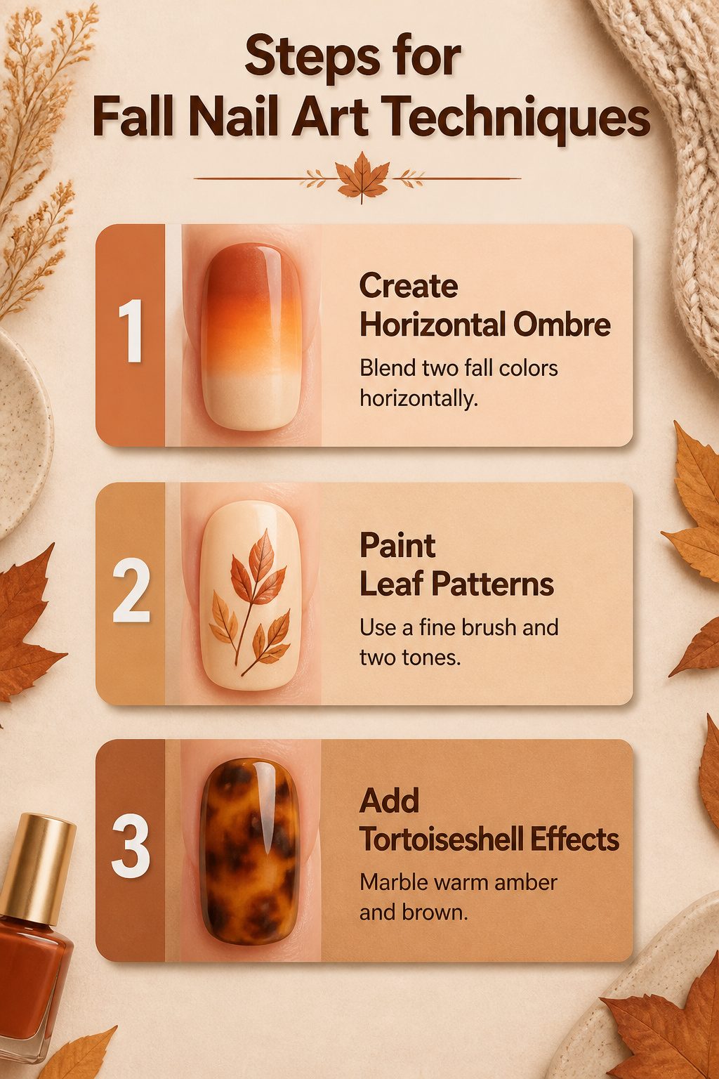
Horizontal ombre lands differently than a vertical fade because it stretches two fall colors across each nail like a sunset held still.
The creamy blend works on any length, though shorter nails show the transition more abruptly; longer canvases let the shift breathe.
Leaf patterns sound harder than they are. A fine brush and two tones of the same color, darker at the base and lighter at the tip, give enough dimension that the shape reads as a leaf without photorealism.
This is the one technique that needs length, or the details crowd the nail and turn muddy.
Tortoiseshell gives the most payoff for the least gear. Warm amber and brown marble together without stickers or stamps, and the dimensional effect reads as depth rather than clutter.
Sources agree it suits shorter lengths especially well; the pattern stays interesting even on a single accent nail against a neutral base.
Short Nails and Shapes That Elongate
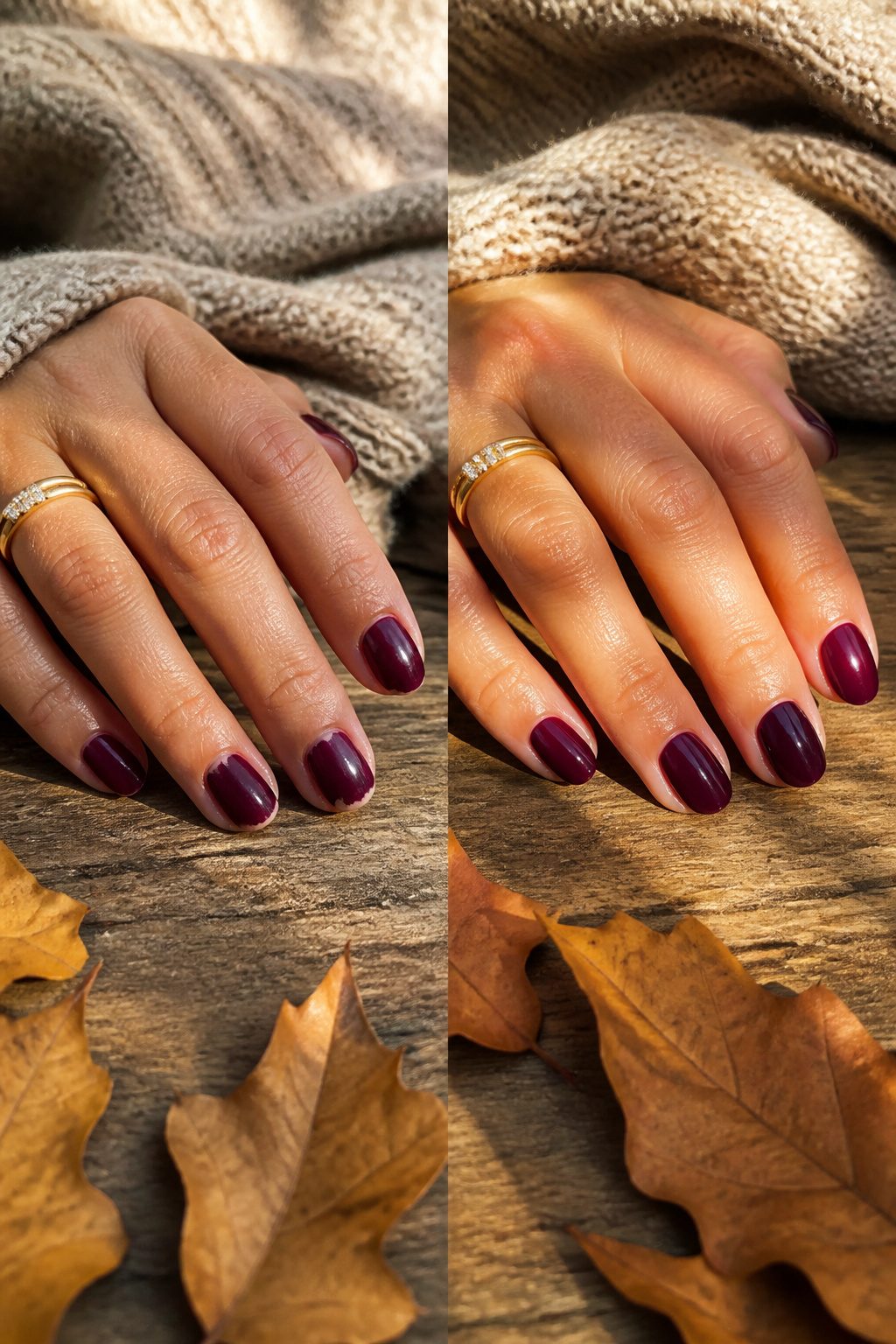
Short nails have become the practical default this fall, and the shape you choose matters more than the length itself.
Almond or soft square shapes draw the eye lengthwise, which is the specific answer readers keep asking for when short fingers need looking longer.
A rounded "squoval" sits somewhere between, practical for everyday wear without the blunt edge of a true square.
The shape also steers your color choice in ways that are easy to miss until you’re under the lamp. Very short square nails with a dark shade can read stubby, the width emphasized instead of minimized.
Almond or soft square shapes give those same deep fall tones room to work, the taper doing the visual stretching so the color doesn’t have to.
Minimalist Fall Designs
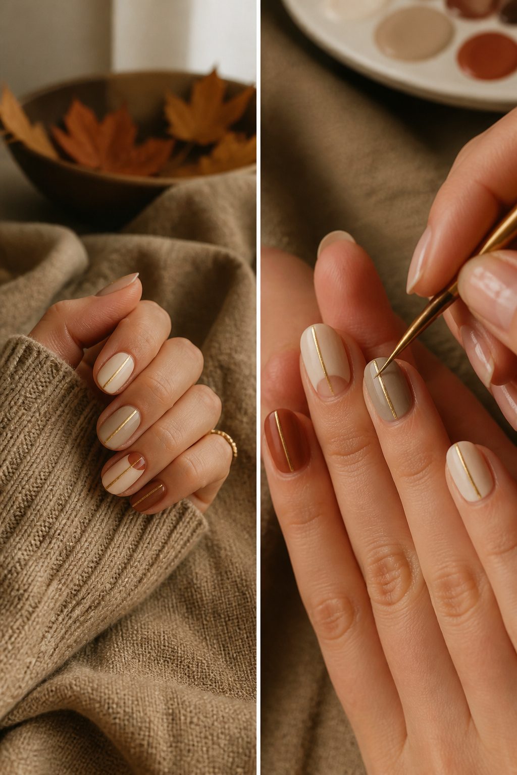
The quiet fall nail ideas usually stay on my hand longer than the loud ones. A thin stripe of antique gold down the center of an otherwise bare nail catches low autumn light without announcing itself across a room.
Negative space works the same way: a half-moon of deep rust or dried sage at the cuticle, with the rest of the nail left clear, reads seasonal because of the color choice, not because anyone painted a leaf.
Color-blocking with two neighboring tones, camel against cognac or slate against charcoal, gives the same effect with even less effort.
A single metallic stripe or a blocked corner ages better than full-coverage tortoiseshell, which chips conspicuously and can look busy by mid-October. The adjacent shades do the seasonal work; the restraint keeps it wearable past Thanksgiving.
These designs also forgive growth.
A stripe or a blocked section grows out invisibly compared with an intricate pattern that drifts downward and looks off-center within ten days. For anyone who wants the autumn reference without the maintenance, minimal marks beat elaborate ones.
Trending Textures Beyond Basic Polish
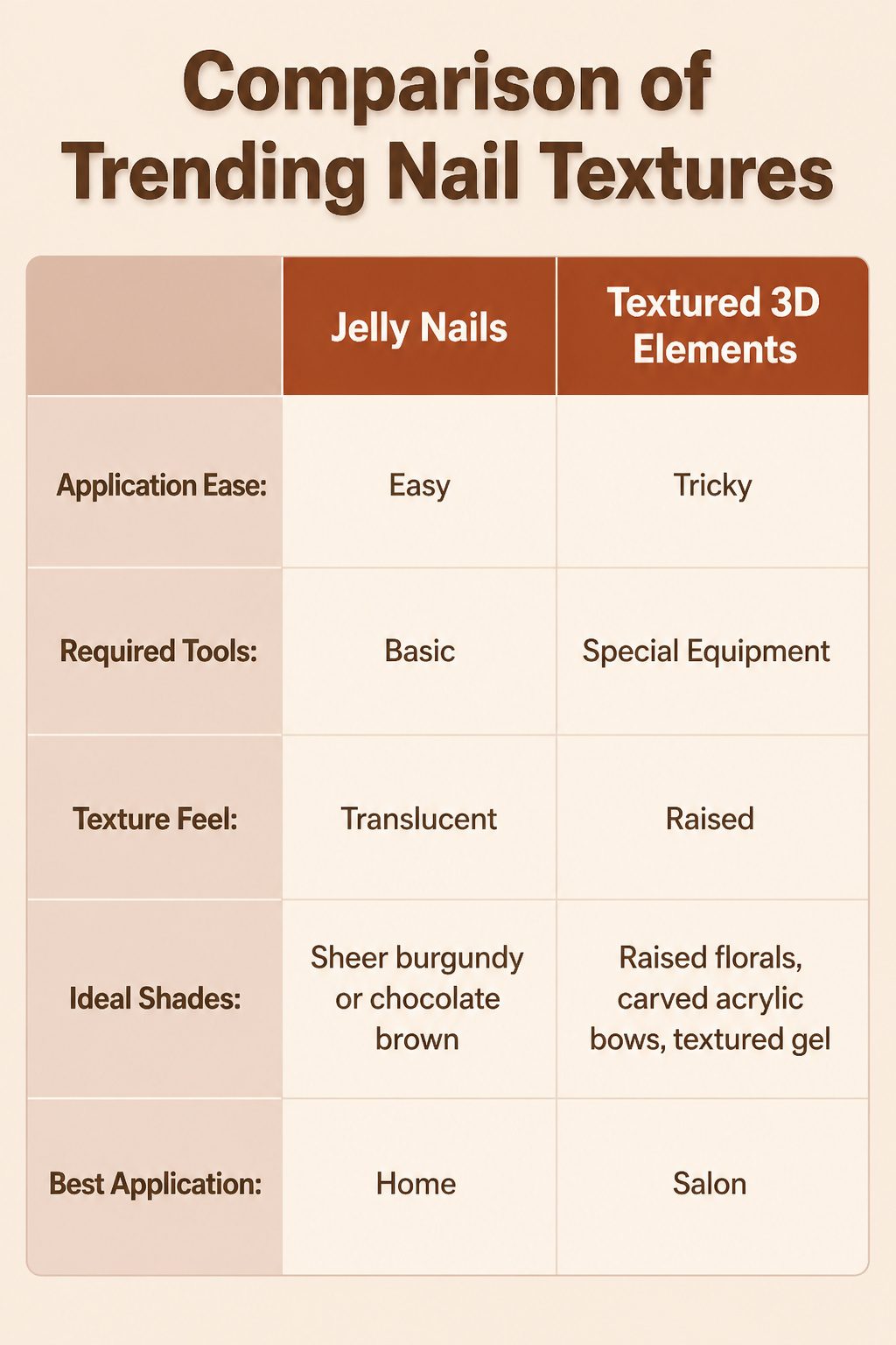
Fall 2026 is pushing past flat color into textures you can actually feel.
Jelly nails, with their translucent, candy-like depth, are the easiest entry point: a sheer burgundy or chocolate brown jelly polish builds that dimensional look with three or four thin coats, no special equipment needed.
The 3D elements are trickier. Raised florals, carved acrylic bows, and textured gel require a steady hand with builder gel or a trip to the salon for proper curing lamps and sculpting tools.
Plaid nails sit in that middle space where patience replaces machinery.
Thin striping brushes and three coordinating shades, deep maroon or multiple browns, hand-draw the intersecting lines. It takes practice, but the tools fit in a home kit.
Pumpkin spice chrome falls the other direction: that soft, reflective finish over a warm orange base needs chrome powder and a no-wipe top coat cured under a quality lamp, so salon application usually wins for the full effect.
Jelly nails and plaid you can trial on a Saturday afternoon. Chrome and true dimensional builds, save for the appointment.
Frequently Asked Questions
What are the biggest fall nail trends this year?
Fall 2026 is all about rich, warm colors and dimensional textures. Burgundy, chocolate brown, burnt orange, and deep earth tones lead the palette, with metallic details, pearl accents, polka dots, and jelly finishes adding interest.
Chrome finishes in olive and gunmetal silver carry over from summer but soften for autumn, while 2010s-inspired shapes like reverse French manicures cycle back with updated color logic.
Can nail art look good on short nails?
Short nails work beautifully for nail art as long as you scale the details down.
Smaller, simpler elements like tiny stars, delicate polka dots, single accent nails, and negative-space designs stay proportional and polished. Tortoiseshell accents and forest green in particular gain depth on shorter lengths, where the color reads deliberate rather than overwhelming.
What nail shape makes short fingers look longer?
An almond or soft square shape draws the eye lengthwise and creates the most elongating effect for shorter fingers.
A rounded or squoval shape offers a practical middle ground. Pairing your shape with intentional fall nail colors helps the whole manicure feel cohesive rather than accidental.