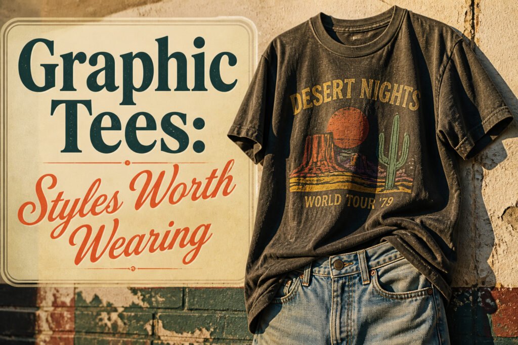
A graphic tee is a cotton shirt printed with imagery, text, or branding that turns the torso into a statement. The catch is that most cheap versions get the details wrong: vector-perfect lines and flat colors that look printed to look worn, rather than actually broken in. A convincing retro graphic has intentional flaws, like registration errors and the soft blur of a screen print washed fifty times.
1. Retro Graphics
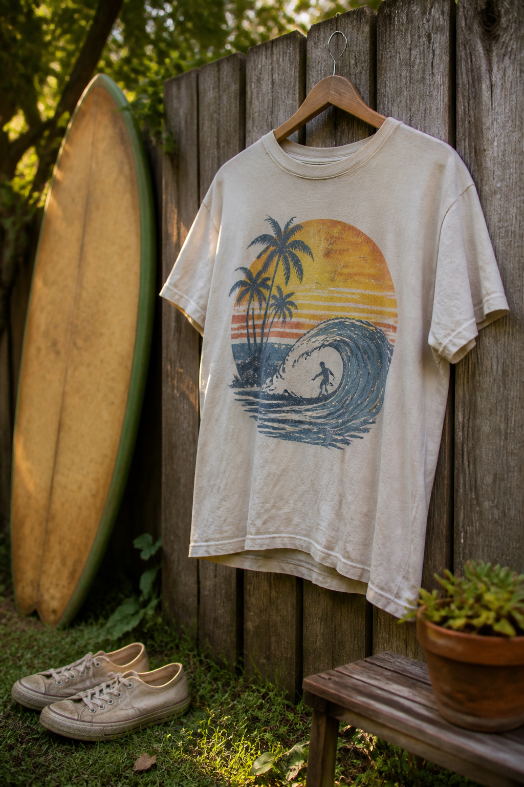
Vintage designs borrow from the 1970s through the 1990s with washed-out color palettes, cracked-ink textures, and logos that look like they were pulled from a thrift store bin. A convincing retro graphic has intentional flaws: registration errors, faded edges, the soft blur of a screen print that has been washed fifty times. Cheap versions get this wrong with vector-perfect lines and colors that sit too flat on the fabric.
The difference shows up close. A good vintage-inspired tee from a retailer like Pacsun uses relaxed fits and prints that actually feel broken in, not just printed to look that way. Their men’s graphic tees lean into this with artwork that references old surf and skate culture without directly copying any single era.
Where these sit in current style is the interesting part. Retro graphics work as a counterweight to minimal outfits: a worn-in band logo or faded sportswear print against clean denim and simple sneakers. The tee does the talking so nothing else has to. Wear one with pieces that are too new and the contrast looks forced; pair it with items that have their own patina and the whole thing settles into place.
2. Band Tees
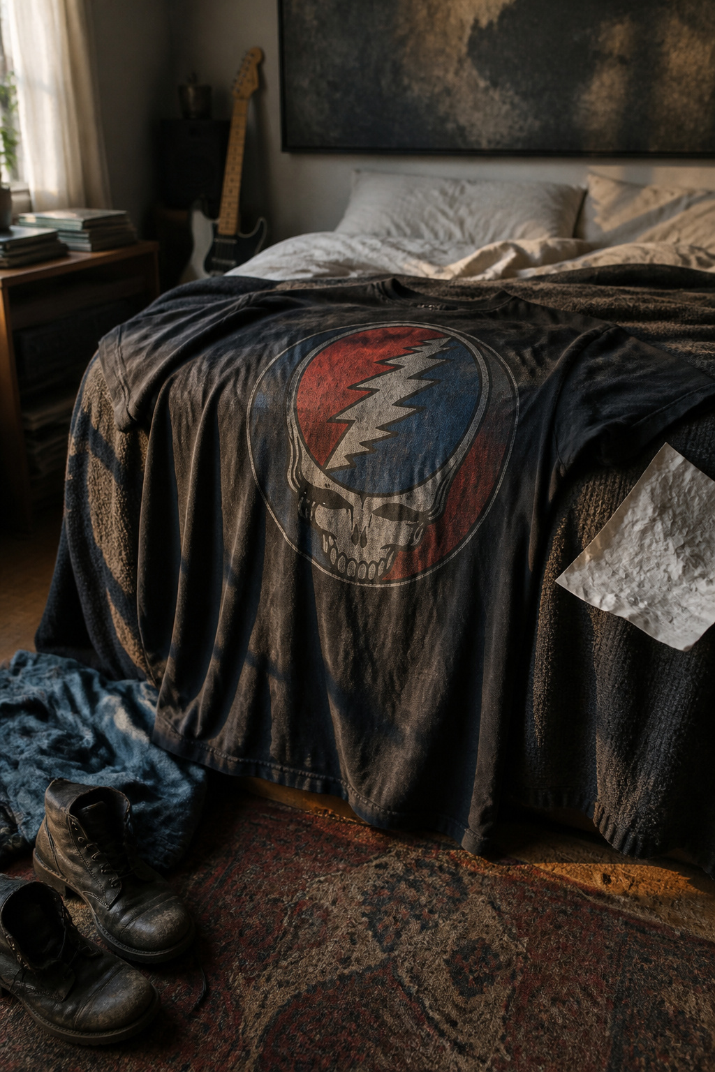
A band tee from the merch table at a real show carries a different weight than the reprint hanging on a rack three years later. The original tour shirt has the date on the back, the venues listed in that small type, the fabric softened from one wash too many in a hotel sink. The reprint borrows the artwork but skips the memory. Both work as graphic tees, yet only one functions as proof.
Music taste becomes wearable identity faster than almost any other interest. A Joy Division tee signals differently than a Taylor Swift era shirt, and both signal differently than a local opener’s screen-print from a hundred-cap room. The design does the talking before the wearer has to.
The difference worth tracking is construction, not just authenticity. Vintage tour shirts were often printed on heavier cotton with single-stitch hems and a boxier cut; modern reprints tend toward thinner blends and tapered fits. If you want the drape, know which version you’re buying.
Collectors treat the original like a document. Everyone else can wear the reprint and still get the cultural reference across. The graphic tee captures the loyalty either way, turning fandom into something visible without demanding a conversation about it.
3. Licensed Artwork
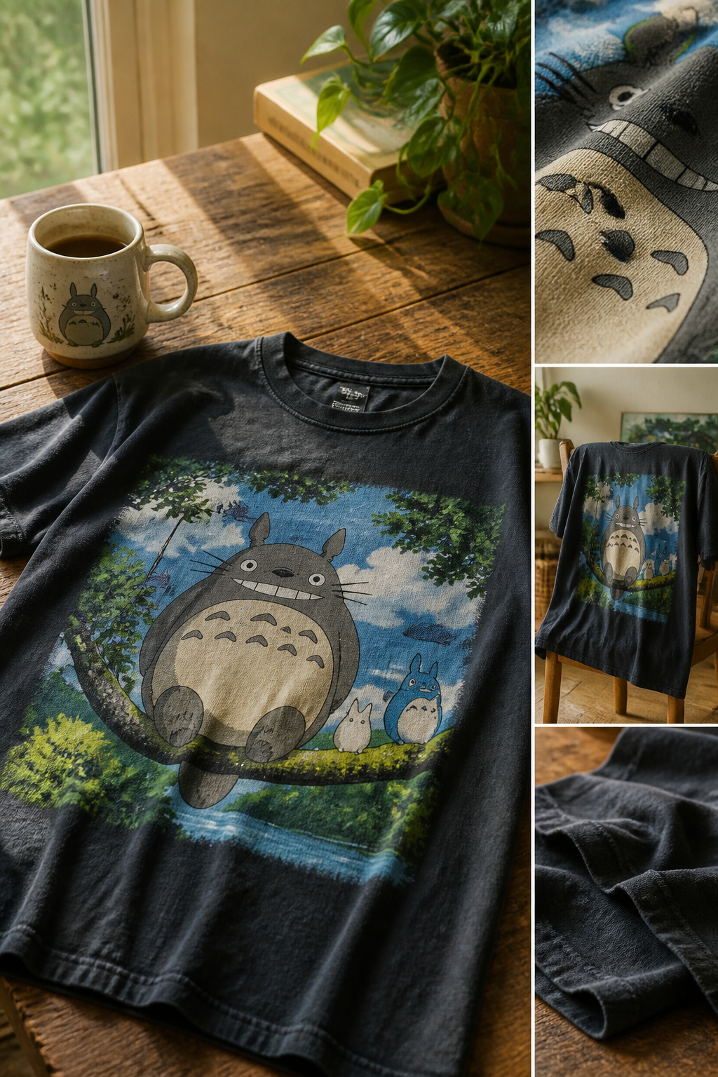
Licensed artwork on graphic tees carries a legal weight that bootleg prints ignore, and the difference shows in the print quality. Officially licensed designs pay royalties to the studio, network, or brand that owns the property, which means the original artwork files come straight from the source rather than being reverse-engineered from a screenshot. A licensed tee will hold its registration; the colors stay where they belong wash after wash, and the fabric doesn’t turn stiff where the ink pooled too thick.
The properties that show up most often are the ones with decades of visual assets to mine: classic films, animated series from the eighties and nineties, and heritage food and beverage brands that never really left the culture. Budweiser and Coca-Cola are fixtures in this space, their vintage logos and old advertising illustrations treated almost as Americana folk art at this point. PacSun carries this lane alongside anime, cartoons, and food and beverage themes, which tells you where the overlap sits: a retro Coca-Cola graphic and a revived eighties cartoon property hit the same nostalgia circuitry, just for slightly different age brackets. The old franchise gets revived, the old brand gets its archive raided, and the tee becomes a way to wear something that reads as cultural memory rather than current advertising.
4. Minimalist Designs
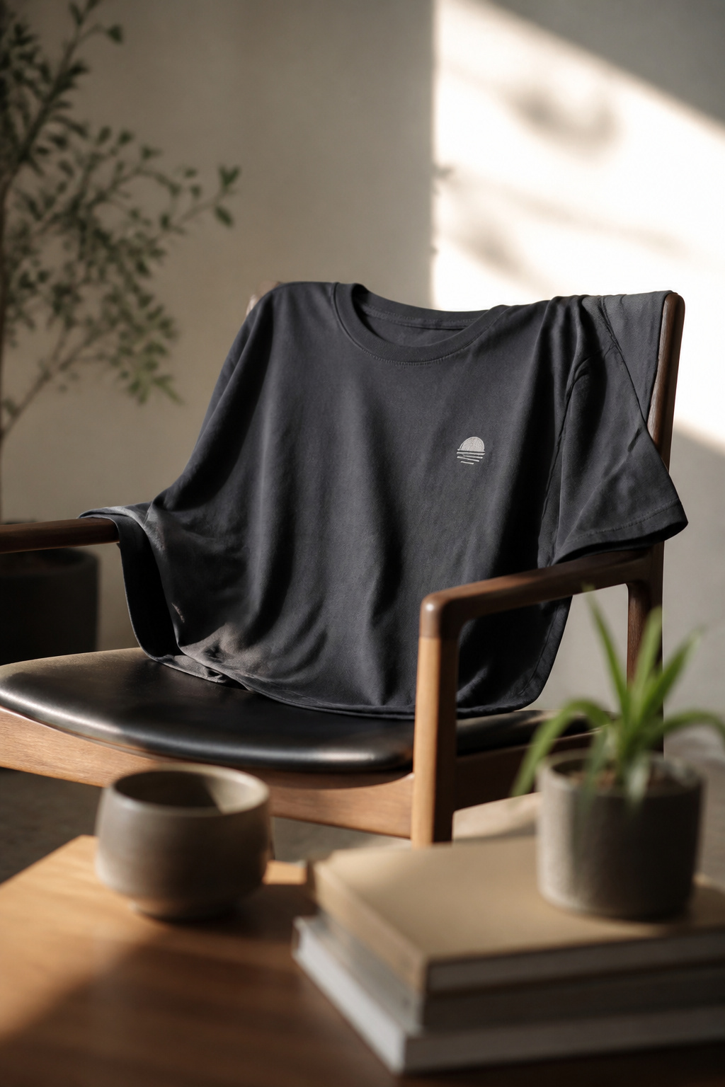
A small chest print or single word sits differently than a full graphic, and that difference is the point. A lowercase serif logo two inches wide reads like a signature, not a billboard, which means the shirt can travel under a blazer without the clash you’d get from loud streetwear branding. The restraint is deliberate: negative space becomes part of the design, and the eye goes to the cut of the tee or the texture of the fabric instead of fighting through color and image.
I used to assume minimal meant boring until I noticed how often these shirts carried outfits that bolder graphics would have broken. A single French word in thin type, a tiny flag emblem at the hem, a period after one letter: these details reward closer looking without demanding it from across a room. The contrast with bold-logo streetwear is useful here. Both live under the graphic tee umbrella, but they solve opposite problems. Streetwear shouts and builds an outfit around itself; the minimalist version steps back and lets the rest of your clothes do the talking. For anyone building a wardrobe where pieces need to work harder and repeat more often, that quietness is the feature worth paying for.
5. Bold Logos
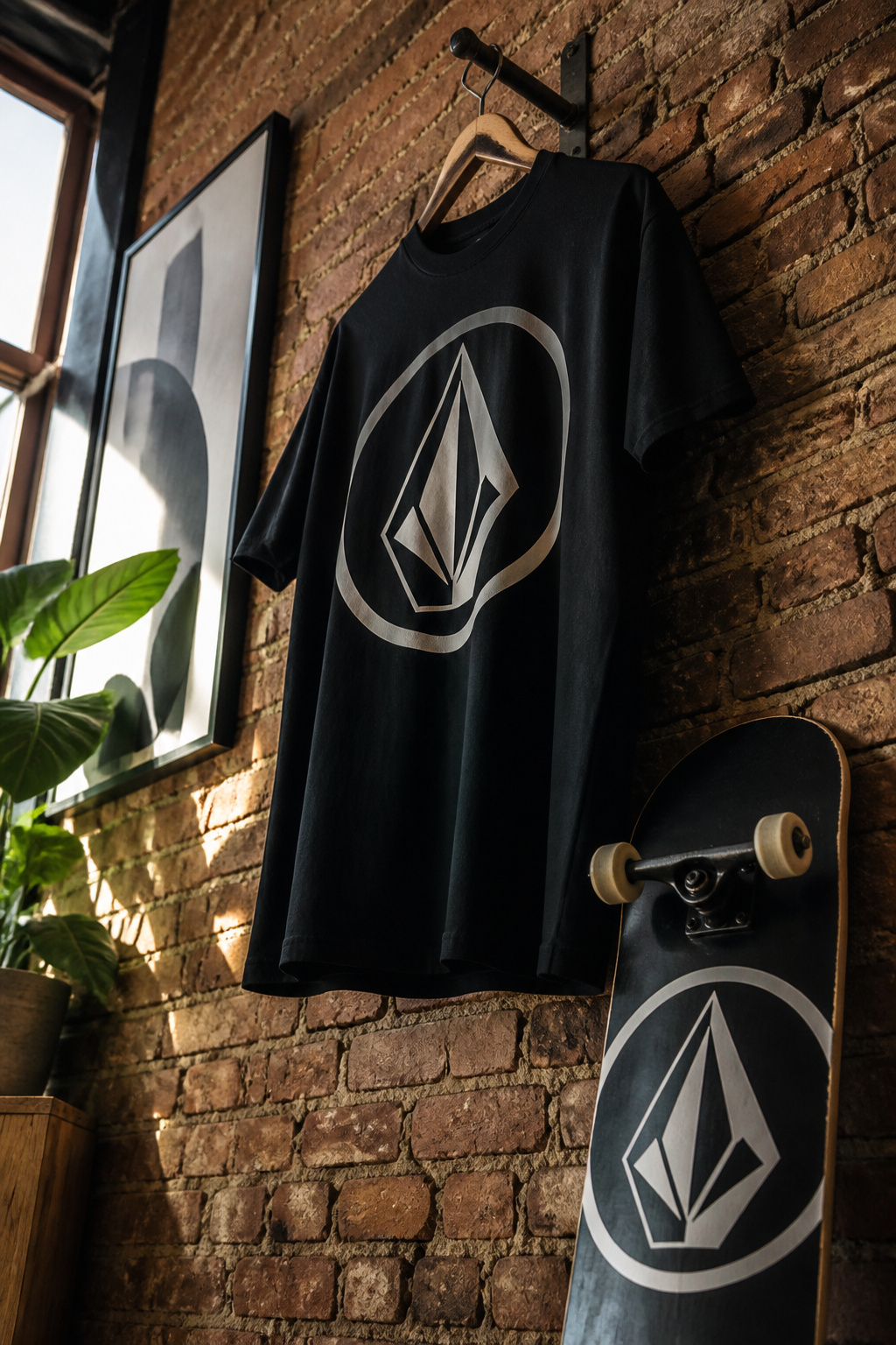
A bold logo on a chest is doing something different from a printed character or album cover. The brand itself becomes the image, which shifts the tee from fan merchandise to streetwear statement. Size matters more here than with other graphic styles. A small crest on the left breast reads like a tag; the same logo blown up across the torso turns the shirt into a billboard. Placement changes the effect too. Center chest is standard, but an oversized mark that drifts toward the hem or wraps slightly to the side looks deliberate rather than default.
Adidas has built entire collections around this approach, with the Trefoil or three stripes scaled to dominate the front of a tee. Fear of God ESSENTIALS does something quieter but similar, letting the wordmark sit large and centered in a way that reads as uniform-like. Both labels treat the logo as the design rather than adding to it, which is the defining difference from licensed artwork. A bold logo tee works when the brand itself carries the weight, not when the graphic needs explanation.
6. Anime and Cartoon Themes
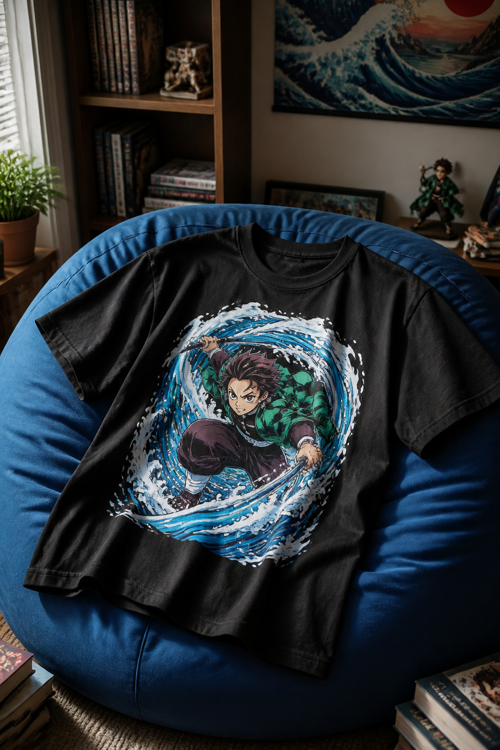
Anime and cartoon graphics have moved well beyond convention hall merch tables. Dragon Ball, Naruto, and Studio Ghibli designs now sit on the same racks as band tees and fine-art prints at major retailers, and the distinction between fan gear and streetwear has largely dissolved. Pacsun files anime, art, and cartoons as three separate graphic tee categories, which tells you how seriously the category now rates against other established themes.
The crossover works because these designs borrow the same visual language as music and art graphics: bold color blocks, distressed printing, oversized fits. A Sailor Moon tee and a Basquiat-licensed shirt often share the same cotton weight and drop-shoulder cut. What separates them is the community signal. Wearing Akira or One Piece marks you as part of a specific conversation, the same way a Joy Division cover does.
Retailers have noticed which series broke through to buyers who never attended a con. Demon Slayer and Jujutsu Kaisen moved volume at fast-fashion price points last season, while vintage-style Pokémon and early Cartoon Network prints target the nostalgia layer. The risk is overproduction: once a series peaks in mainstream awareness, the tee supply often outlasts the moment. I tend to look for designs from shows I actually finished, or graphics that work as pure composition if the reference ages poorly.
How to Style Graphic Tees
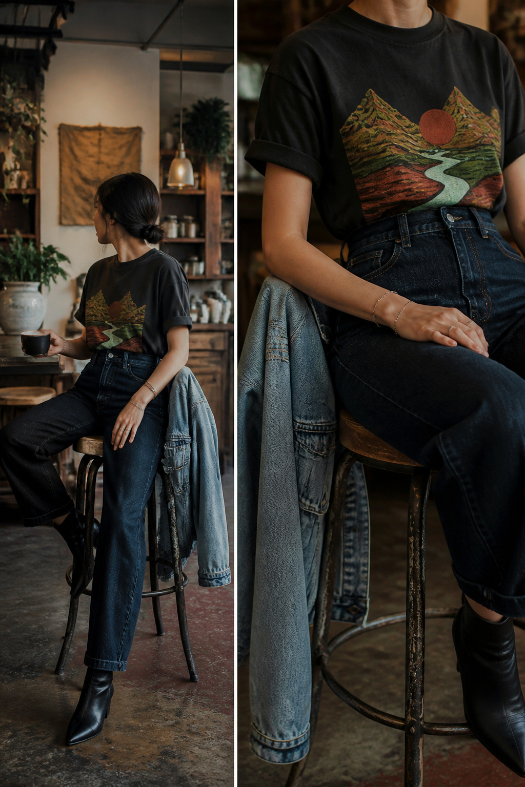
Jeans are the default pairing for graphic tees, but the graphic itself should steer the cut. A loud, oversized print with saturated colors works better with slim or straight-leg denim that doesn’t compete for attention; a smaller, quieter graphic can handle a looser, more relaxed jean without looking swallowed. The tuck decision matters more than most people think: a full tuck into high-waisted jeans pulls the eye to the waist and gives structure to a boxy tee, while leaving it untucked keeps things easy for running errands or grabbing coffee. Half-tucks split the difference but read as trying too hard if the shirt is thick or stiff.
Shorts follow the same logic. Longer inseams and heavier fabrics, like canvas or structured cotton, balance a substantial graphic; flimsy athletic shorts with a dense print up top looks top-heavy. Layering under a denim jacket or an unbuttoned overshirt adds warmth for evening without dressing the tee up, and the jacket’s wash should echo the graphic’s tone: dark indigo with muted vintage prints, lighter washes with bolder contemporary ones.
Shoes are where intention shows. Clean white leather sneakers or simple canvas lace-ups signal you chose this; beat-up running shoes or plastic slides can tip the whole thing toward careless. That distinction isn’t about money spent, it’s about whether the shoe looks chosen for the outfit or grabbed on the way out.
What Graphic Tees Are Made Of
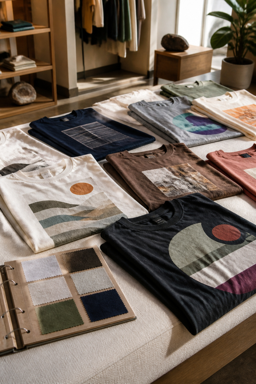
Most graphic tees start with cotton or a cotton blend, and that choice matters more than the print itself. Pure cotton breathes better than anything else, which is why it still dominates the rack, but a cotton-polyester mix solves the shrinkage problem that ruins a good fit after three washes. The fabric weight, measured in grams per square meter, determines whether a tee drapes cleanly or stands away from the body like a tent. Heavier cloth holds its shape longer and survives the dryer without turning into a crop top.
The blend ratio also affects what happens to the graphic. All-cotton takes water-based ink beautifully, but a surface print on slick poly can crack when the fabric flexes. Heat transfers bond differently to each fiber, so a design that lasts years on one shirt flakes off another in months.
Fit runs the full range now, from boxy dropped-shoulder cuts that skim the hip to fitted styles that sit close through the chest and arm. Neither is the default anymore; both have their place depending on what sits on top or how much movement the day requires.
Sustainability and Custom Options
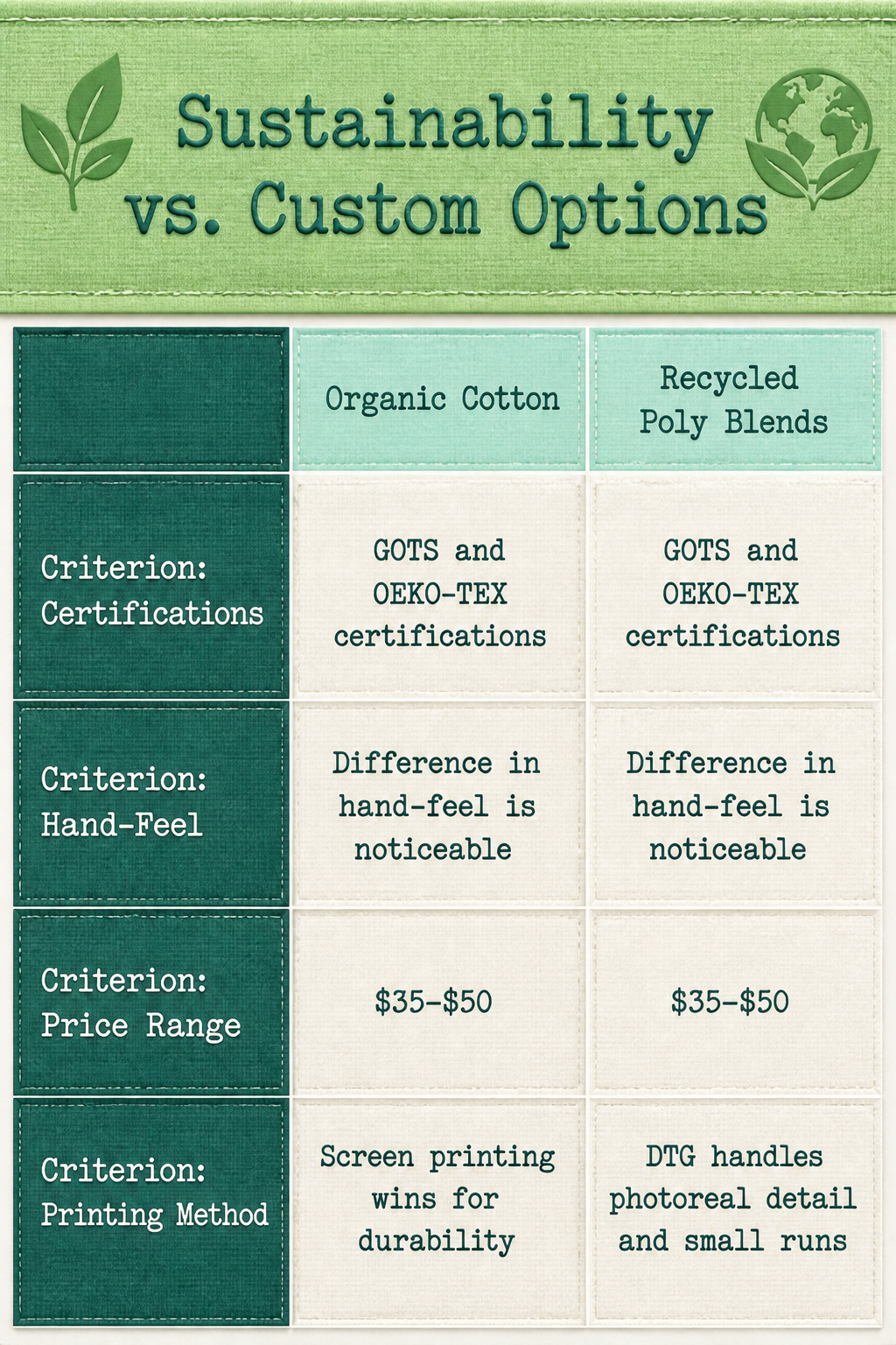
Organic cotton and recycled poly blends are showing up in more graphic tee lines than they used to, and the difference in hand-feel is noticeable once you start comparing labels. GOTS and OEKO-TEX certifications are the ones worth looking for; without them, "eco-friendly" is just a word on a hangtag. The premium runs about 30–40% over conventional cotton, which puts most sustainable graphic tees in the $35–$50 range rather than the $15–$20 fast-fashion bracket.
Custom printing has gotten sharper than the iron-on days, though quality still splits between direct-to-garment and screen setups. DTG handles photoreal detail and small runs, but the print sits on top of the fabric and cracks faster at the collar and underarm stress points. Screen printing still wins for durability on orders of a dozen or more, which matters if you’re designing for a team or an event rather than a one-off birthday gift.
Both lanes attract the same buyer now: someone who wants the shirt to say something specific, whether that’s a political message, an inside joke, or just proof that they checked where the cotton came from. The overlap isn’t accidental. Individual expression and environmental accountability both ask the same question of mass production: why this, and why made this way?
Frequently Asked Questions
What are graphic tees?
Graphic tees are casual t-shirts featuring designs, graphics, or logos that express personal style and interests. They range from vintage band artwork and licensed cartoon characters to bold streetwear logos and minimalist chest prints. The category covers everything from counterculture signals to nostalgic references, all using printed imagery to turn a basic shirt into a statement piece.
How do I style graphic tees?
Match the cut to the graphic’s intensity: loud, oversized prints pair with slim or straight-leg denim that won’t compete, while smaller graphics can handle relaxed jeans without getting lost. A full tuck into high-waisted jeans gives structure to boxy cuts; untucked keeps things casual. Layer under denim jackets or overshirts, matching the jacket wash to the graphic’s tone. Finish with clean white leather sneakers or simple canvas lace-ups that look chosen, not grabbed.
What materials are graphic tees made from?
Most start with cotton or cotton-polyester blends. Pure cotton breathes best, but adding poly cuts shrinkage after repeated washes. Fabric weight measured in grams per square meter determines drape: heavier cloth holds shape and survives dryers better. The blend ratio also affects print longevity. All-cotton takes water-based ink smoothly, while surface prints on slick poly blends can crack when the fabric flexes. Fit now spans boxy dropped-shoulder cuts to fitted chest-hugging styles.